The Met Museum (Conceptual Rebrand)
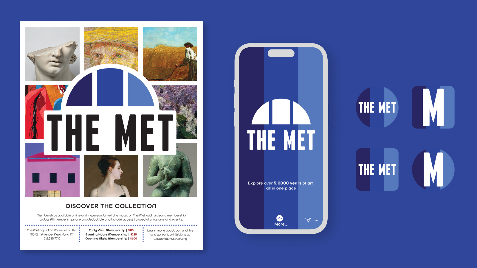
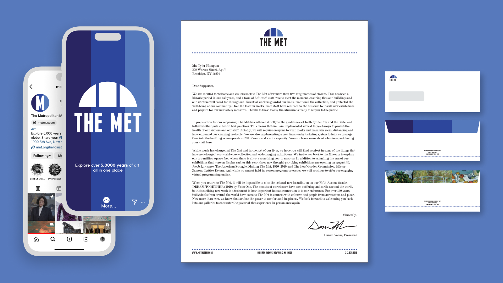
For SVA, I completed a conceptual rebranding package for the Metropolitan Museum of Art in Manhattan. The rebranding focused on fusing works from the collection with the iconic architecture of the museum itself, resulting in a package that feels modern, colorful, and art-focused.
Logo Design & Typography
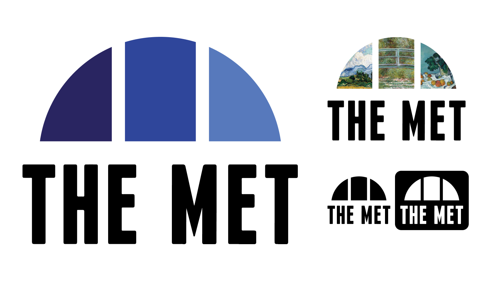
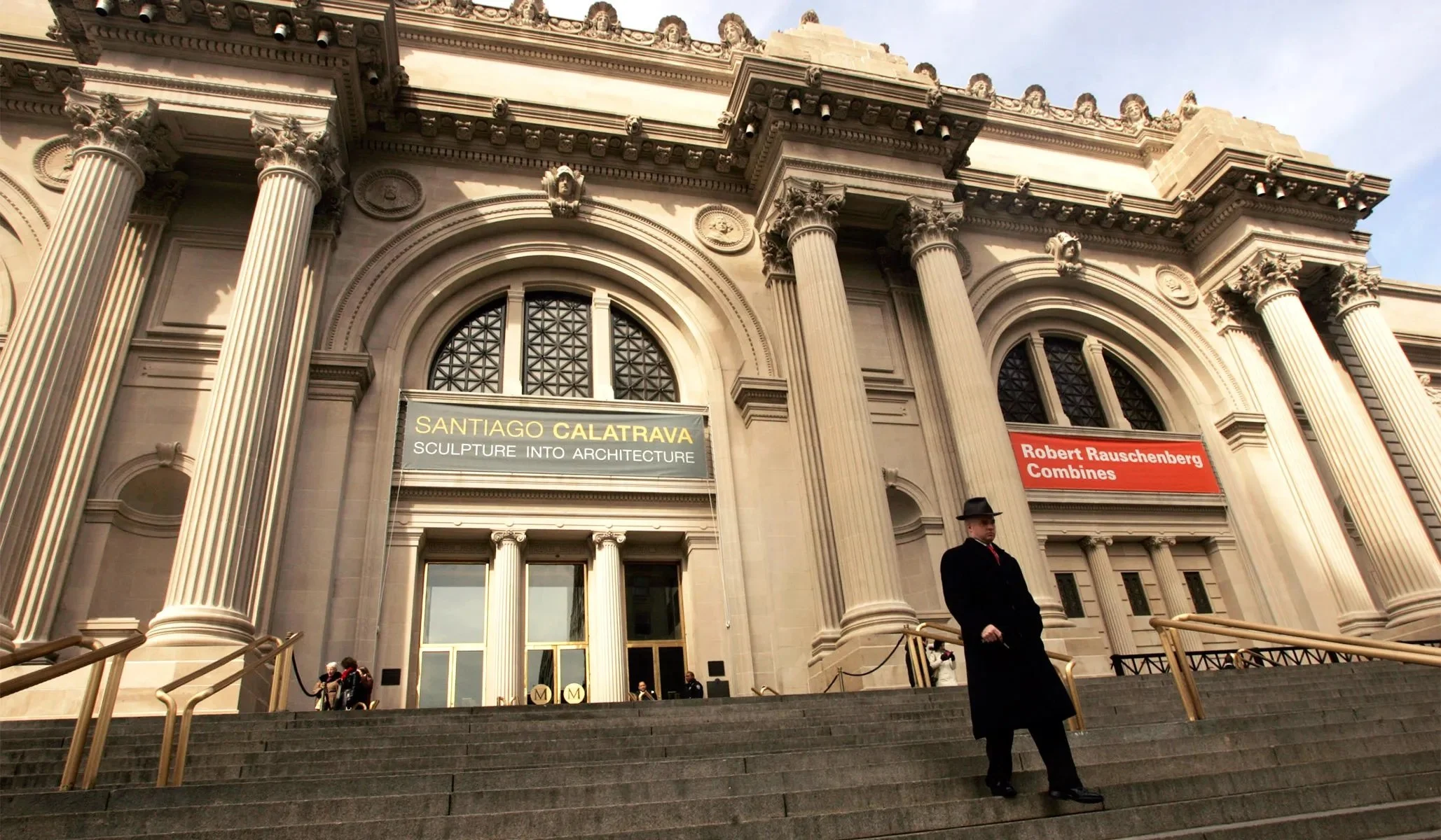
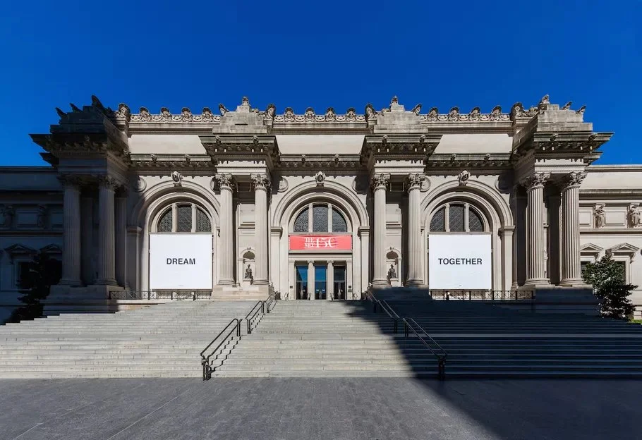
For the new Met logo, I referenced the iconic Diocletian windows that decorate the facade of the museum itself (pictured below right). In this way, the brand celebrates and references its own home. As a museum that celebrates art from all eras of human history, the three shades of blue work in harmony to reference the past, present, and future of art.
Alternative logo designs include versions using works from the collection for targeting campaigns for specific exhibitions, such as the one on right, which uses paintings from the Impressionism era.
Typographically, the current Met logo is rather structured and refined, so my redesign updated and refreshed it, utilizing Franchise Bold in the logo itself, and All Round Gothic for other display text.
Social Media & Marketing Campaigns
A key element of my redesign was a push on social media in order to engage with a younger audience with targeted ads and a fresher brand presence. By keeping the doors open for younger generations, the Met can ensure a future for the art it is home to.
Museums classically use snail mail campaigns as well, as larger donors tend to be older and more established, so I also designed letterhead and envelopes to approach marketing from this angle as well.
The Museum social icons also got a redesign to reflect the logo, see below.

